
Meanwhile, prices for the most expensive homes increased modestly, up 1 percent year over year.
California’s San Jose and Orange County markets buck the national trend, with prices for the most affordable homes falling this year.
Prices for the most affordable third of homes in San Jose dropped 3.8 percent year over year in June—from an average of $760,309 to $731,688—the fifth consecutive month of declining prices in the category after six straight years of growth. The story is similar in Orange County, where prices for the most affordable third of homes dropped 2.6 percent year over year in June, from an average of $461,158 to $449,390. Home prices in that category have dropped four of the last five months in Orange County (also referred to as Anaheim) after four straight years of increases.
In both San Jose and Orange County, among the most expensive areas in the country, supply of affordable homes has been rising since summer 2018 after nearly two straight years of year-over-year declines. Supply for the most affordable homes was up 94.1 percent annually in San Jose in June, and it was up 24.5 percent in Orange County during the same time period.
Dropping prices and rising inventory for the most affordable homes follow overall housing market trends in the two California metros, which have both been cooling slightly in recent months after years of rampant growth. San Jose saw its median home price fall 4.9 percent year over year in June, marking the fifth straight month of declines and the steepest decline posted by any metro area tracked by Redfin last month. Meanwhile, home prices in Orange County were up just 0.7 percent.
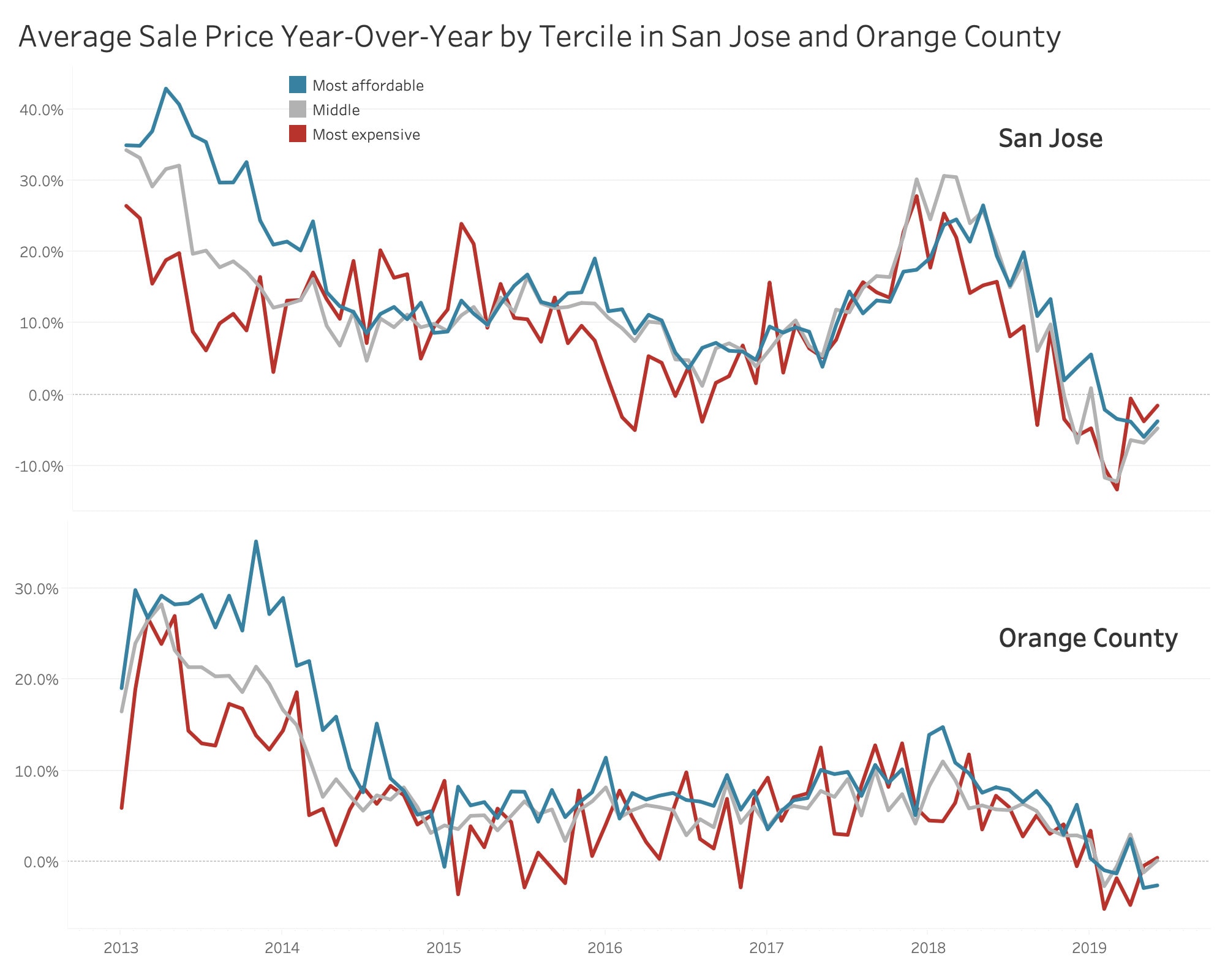
Prices for the most expensive third of homes dropped 1.6 percent in San Jose and rose just 0.5 percent in Orange County. It’s the eighth consecutive month of declines in the category in San Jose after nearly two years straight of price growth. Supply for the most expensive tier of homes was up 50.5 percent year over year in San Jose in June, and up 11.2 percent in Orange County.
“I’ve been feeling a slowdown in the Bay Area the past few months. The beginning of summer feels like the end of summer usually does, with prices coming down and inventory up,” said Redfin agent Chad Eng, who specializes in the San Jose area. “The cooldown is more pronounced in specific parts of the area, specifically greater San Jose.”
But San Jose and Orange County are two of just three metro areas in the U.S. where home prices for the most affordable group of homes fell in June. The other is Memphis, where home prices for the most affordable tier fell 6.6 percent year over year to an average of $78,808 in June.
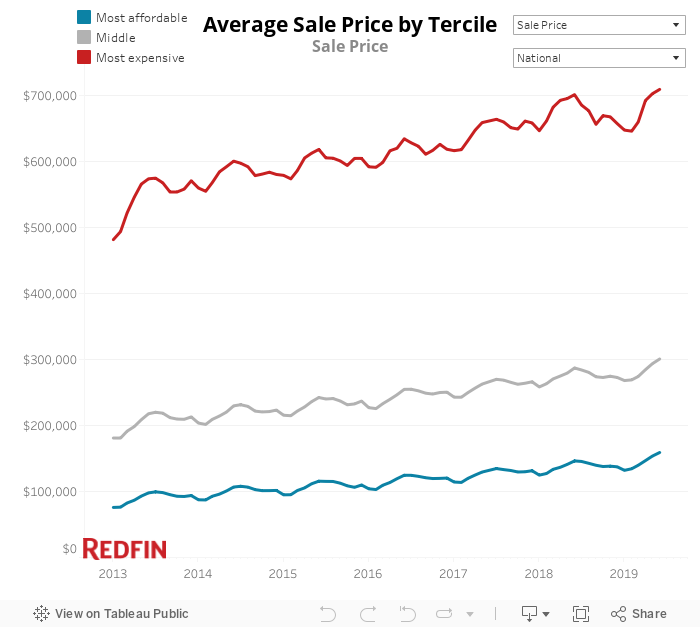
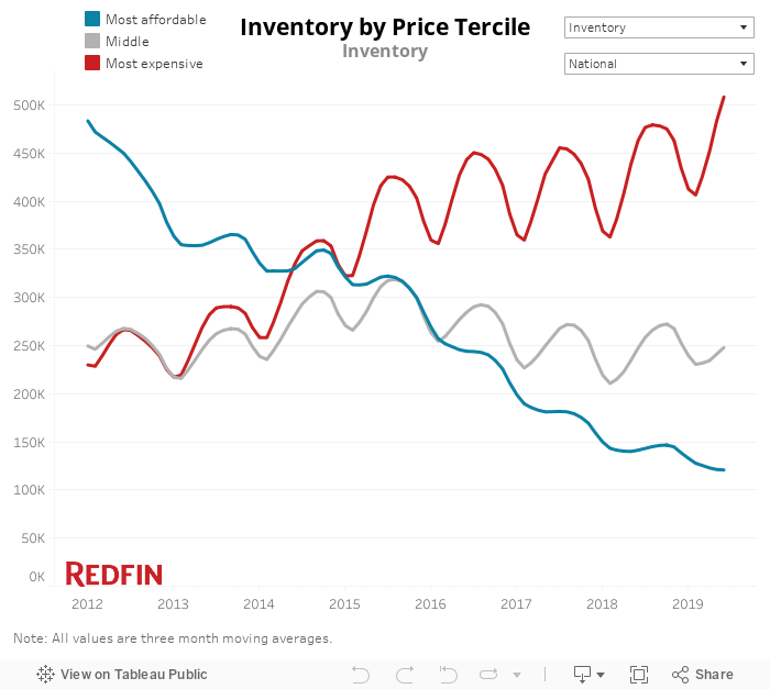
Elsewhere across the country, the price trend for the most affordable group of homes is the opposite: Prices for the most affordable third of homes nationwide were rising quickly in June while supply was shrinking. Contrast that with the most expensive third of homes, which are seeing prices rise slightly as supply grows by double digits.
Prices were up 8.7 percent year over year in June for the most affordable third of homes nationwide (those priced up to $232,000), the second-biggest increase in more than a year (the highest was last month, with an 8.9% growth rate). For homes in the most expensive third (more than $385,000), prices grew just 1.1 percent year over year. Even when the overall real estate market cooled in late 2018 and early 2019, it didn’t cool much for the most affordable tier: Price growth for the most affordable group of homes hasn’t dropped below 4.5 percent in at least the last seven years.
Here’s a closer look at home-price growth in all three price tiers since the beginning of 2013:
The difference in supply changes between affordable and high-priced homes is more drastic. For the most affordable tier, supply was down 14.5 percent year over year in June. It was up by 9.7 percent for the most expensive tier.
For the most expensive tier of homes, supply has been rising on a year-over-year basis since mid-2013. But for the most affordable tier, supply has been dropping since at least 2012, and most months during that period it has dropped by double digits.
The fact that prices for the most affordable homes around the country are rising faster than they are for the most expensive homes is one symbol of the housing affordability crisis that has taken hold of many parts of the country. Overall market conditions have improved for homebuyers: Home prices were up 3.4 percent in June, a modest growth rate compared to the 7 to 9 percent price jumps regularly seen in early 2018, and mortgage interest rates are lower than they’ve been in nearly two years. But the rampant home-price growth in the most affordable segment of the housing market is problematic for working- and middle-class buyers, the group of people who would have the most trouble affording any home.
“Now that the economic expansion is in its 10th year, some working- and middle-class Americans are finally starting to see wage increases significant enough to ready them buy their first homes,” said Redfin chief economist Daryl Fairweather. “But economic growth is a double-edged sword for the housing market. The increase in demand for low- and moderately priced starter homes is pushing up prices for the most affordable segment of the market. Over the next few years, prices for the most affordable homes are likely to continue growing rapidly, pushing homeownership further out of reach for people with lower incomes.”
Below is a look at the metro areas that stand out in terms of price change and inventory change for the most affordable and most expensive groups of homes.
Areas with the Biggest Price Changes for the Most Affordable Tier of Homes
Price growth for the most affordable group of homes was strongest in relatively affordable areas. Camden, New Jersey and Detroit were home to the biggest home-price gains for the most affordable homes, with home prices up 28 percent and 22.7 percent year over year in June, respectively, for the lowest price tier. They’re followed by Newark, where home prices for the most affordable tier increased 20.9 percent year over year.
“There are simply more homebuyers than homes for sale at the more affordable price point here in Detroit, which makes that part of the market more competitive and eventually drives up prices,” said local Redfin agent Adam Rasor. “The other piece of the puzzle is that we get quite a few people moving into Michigan from more expensive places like Chicago, Seattle and California specifically for the affordability. And those people aren’t selling a million-dollar home in California to buy another million-dollar home in Detroit. They tend to want to cut their housing payments substantially while still getting something larger for a growing family.”
| Metros where home prices in the most affordable price tier have risen most (June 2019) | ||
| Metro area | Year-over-year price growth | Average sale price for most affordable third of homes |
| Camden, NJ | 28% | $111,716 |
| Detroit, MI | 22.7% | $63,205 |
| Newark, NJ | 20.9% | $214,584 |
| Knoxville, TN | 19.9% | $125,006 |
| Philadelphia, PA | 19.2% | $120,762 |
Areas with the Biggest Price Changes for the Most Expensive Tier of Homes
Prices for the most expensive third of homes dropped most in Charleston, South Carolina (-5.6%); Los Angeles (-5.4%) and Fort Lauderdale, Florida (-5.1%).
| Metros where home prices in the most expensive price tier have dropped most (June 2019) | ||
| Metro area | Year-over-year price decline | Average sale price for most expensive third of homes |
| Charleston, SC | -5.6% | $672,412 |
| Los Angeles, CA | -5.4% | $1,499,236 |
| Fort Lauderdale, FL | -5.1% | $601,936 |
| Lake County, IL | -3.2% | $537,704 |
| West Palm Beach, FL | -3% | $787,451 |
Price growth for the most expensive segment of homes was also the strongest in June in relatively affordable metros. Philadelphia and Knoxville, Tennessee saw the nation’s biggest price gains for the most expensive homes, with home prices up more than 14 percent in each metro. But in both of those areas, the average sale price for the most expensive tier of homes in June was less than $600,000, which is lower than the average price of the most affordable third of homes in San Jose.
| Metros where home prices in the most expensive price tier have risen most (June 2019) | ||
| Metro area | Year-over-year price growth | Average sale price for most expensive third of homes |
| Philadelphia, PA | 15.6% | $578,003 |
| Knoxville, TN | 14.2% | $433,681 |
| St. Louis, MO | 9.9% | $451,808 |
| Detroit, MI | 9.8% | $346,154 |
| Camden, NJ | 8.8% | $378,581 |
Unequal Metros: Areas With the Biggest Difference in Price Growth Between the Most Affordable and Most Expensive Tiers
The metro with the biggest year-over-year increase in home prices for the most affordable tier of homes (Camden) is also the area with the largest price-growth gap between the affordable and expensive tiers. Camden and Newark, the second metro on the list, both had price-growth gaps of more than 18 percentage points between the most affordable and most expensive tiers in June.
While the fact that prices rose faster for affordable homes than expensive homes is problematic for homebuyers on a budget in those areas, it also means people who own homes in the lowest price tier are seeing their home values appreciate quicker than those in the most expensive tier.
| Metros with the largest price-growth gap between the most affordable and most expensive tiers (June 2019) | |||
| Metro area | Year-over-year price growth gap (in percentage points) | Year-over-year price change for most affordable third of homes | Year-over-year price change for most expensive third of homes |
| Camden, NJ | 19.2 pts. | 28% | 8.8% |
| Newark, NJ | 18.5 pts. | 20.9% | 2.4% |
| Charleston, SC | 14.8 pts. | 9.2% | -5.6% |
| New Orleans, LA | 14.8 pts. | 14.6% | -0.2% |
| New Haven, CT | 13.8 pts. | 12.6% | -1.2% |
Areas with the Biggest Changes in Supply for the Most Affordable Tier of Homes
Supply of the most affordable homes dropped most in inexpensive metros like Tacoma, Washington, where inventory was down nearly 48 percent year over year in June, and Rochester, New York, where supply dropped more than 40 percent during the same time period.
| Metros where inventory in the most affordable price tier has dropped most (June 2019) | ||
| Metro area | Year-over-year inventory change | Average sale price for most affordable third of homes |
| Tacoma, WA | -47.5% | $278,910 |
| Rochester, NY | -41.5% | $95,759 |
| Tucson, AZ | -37.2% | $152,840 |
| Omaha, NE | -35.1% | $140,318 |
| Worcester, MA | -35.1% | $180,134 |
San Jose (94.1%), Denver (62.6%) and Orange County (24.5%) posted the biggest year-over-year inventory gains for affordable homes in June. Rising inventory is representative of those expensive West Coast metros cooling slightly after years of red-hot real estate markets.
| Metros where inventory in the most affordable price tier has risen most (June 2019) | ||
| Metro area | Year-over-year inventory growth | Average sale price for most affordable third of homes |
| San Jose, CA | 94.1% | $731,688 |
| Denver, CO | 62.6% | $291,611 |
| Orange County, CA | 24.5% | $449,390 |
| Oakland, CA | 21.2% | $497,135 |
| Las Vegas, NV | 7.4% | $192,752 |
Areas with the Biggest Changes in Supply for the Most Expensive Tier of Homes
Expensive West Coast markets posted the biggest gains in supply for the most expensive tier of homes in June. San Jose (50.5%) and Seattle (49%) led the way, followed by a slightly smaller increase in Oakland (39.3%).
| Metros where inventory in the most expensive price tier has risen most (June 2019) | ||
| Metro area | Year-over-year inventory growth | Average sale price for most expensive third of homes |
| San Jose, CA | 50.5% | $2,347,368 |
| Seattle, WA | 49% | $1,176,334 |
| Oakland, CA | 39.3% | $1,434,793 |
| Detroit, MI | 34.6% | $346,154 |
| Knoxville, TN | 34.4% | $433,681 |
Even in the metros where housing supply in the most expensive tier dropped most, it didn’t drop nearly as much as it did in the metros that saw the biggest supply declines for the most affordable group of homes. Rochester, New York experienced the biggest dip, with a 10.9 percent decline in inventory for the most expensive homes, followed by Washington, D.C. (-6.8%) and St. Louis (-4.4%).
| Metros where inventory in the most expensive price tier has dropped most (June 2019) | ||
| Metro area | Year-over-year inventory decline | Average sale price for most expensive third of homes |
| Rochester, NY | -10.9% | $322,770 |
| Washington, D.C. | -6.8% | $832,678 |
| St. Louis, MO | -4.4% | $451,808 |
| Austin, TX | -4.2% | $672,255 |
| Philadelphia, PA | -3.6% | $578,003 |
Methodology
For the statistics on sale price and price growth, we divided each month’s home sales into three equal-sized tiers based on sale price. The “lowest” tier is the least expensive and the “highest” tier is the most expensive. Then, we calculated the median sale price of all homes within each tier. The cutoff for each of the price tiers changes based on month and metro area.
For the statistics on inventory and inventory growth, we used all homes that were newly listed in 2015 to create three equal-sized tiers based on list price. The “lowest” tier is the least expensive and the “highest” tier is the most expensive. Then, we assigned all available homes in a given month to the 2015 price tiers and calculated inventory for each tier. The cutoff for each of the tiers changes based on metro area.
To be included in the metro-level stats reported above, a metro must have had at least 300 homes sold in June.


