
Redfin’s new affordability tool allows users to visualize and compare housing affordability on different incomes and in different parts of the country.
In the Atlanta metro area, 45.7 percent of homes currently for sale are affordable on $61,372, the median U.S. household income in 2017, the most recent year for which data is available. In the Phoenix metro, 40.7 percent of homes are affordable on that income, and in the San Francisco area it’s less than 1 percent.
That’s according to Redfin’s new housing affordability dashboard, which allows users to quickly understand how affordable homes are in a given area, and compare affordability among different parts of the U.S. To calculate affordability, the dashboard takes into account household income, down payment percentage, mortgage interest rate, mortgage length and property type, and operates on the guideline that homeowners should spend no more than 30 percent of their gross monthly income on housing. Check out our new housing affordability dashboard in the Redfin Data Center.
“A picture is worth a thousand words when it comes to understanding the housing affordability crisis,” said Redfin chief economist Daryl Fairweather. “With this new tool, researchers, policymakers and homebuyers can quickly see which cities and neighborhoods have the fewest affordable homes and which have the most, which will help us all make better decisions about how to invest in real estate.”
Embedded below is one of the dashboard’s two views, which shows the share of affordable homes in the 100 most populated metro areas on the U.S. median household income.

The higher share of affordable homes for sale in Phoenix and Atlanta than San Francisco is one reason why the San Francisco metro, where the median home sale price is $1.3 million, topped the list of metro areas Redfin users were looking to leave in all four quarters of 2018. It also helps explain why the Phoenix and Atlanta areas, where the median sale prices are $267,000 and $230,000, respectively, were both among the five most popular destinations each quarter of last year.
Tick the household income up to $101,714, the median income for the San Francisco-Oakland-Fremont metro area, and the share of affordable for-sale homes in the area rises, but just to 2.6 percent. On that income, 70.7 percent of homes for sale in Phoenix are affordable, and in Atlanta it’s 76.3 percent. For San Francisco residents moving to Phoenix or Atlanta and keeping the same job, the share of homes they’re able to afford rises significantly.
“A lot of Phoenix homebuyers are transplants from California, moving to capitalize on the lower cost of living,” said local Redfin agent Katie Shook. “I recently worked with a couple who used the equity from their Bay Area home for a down payment on a home here. The wife kept her job and is able to work remotely, and the husband was able to retire.”
Even if new Phoenix or Atlanta residents take jobs with salaries more in line with what’s typical for those areas, the portion of affordable homes is significantly higher than in San Francisco. Move the needle down to the median annual income for the Phoenix metro area, $60,336, and 39.5 percent of homes are affordable. And in Atlanta, 50.4 percent of homes are affordable on the area’s median income of $65,381.
“People who are willing to move across the country can still find affordable housing,” said Fairweather. “Atlanta is a popular migration destination because of its relatively low housing costs and strong jobs market. Major Bay Area tech companies like Pandora and Square are following talent, opening offices in Atlanta. But as more affluent migrants move in, Atlanta housing prices may not stay affordable for very long.”
In addition to illustrating the difference in affordability between metro areas and on various incomes, the tool allows users to visualize how affordability varies by location, down to the zip-code level.
Below is a look at affordability by zip code in San Francisco, Phoenix and Atlanta, based on the median household incomes for those areas. Click on the gray boxes to switch from one metro to another. Use the drop-down menus to select a different metro or view the share of homes affordable with a different income, down payment percentage, mortgage rate and/or mortgage length.
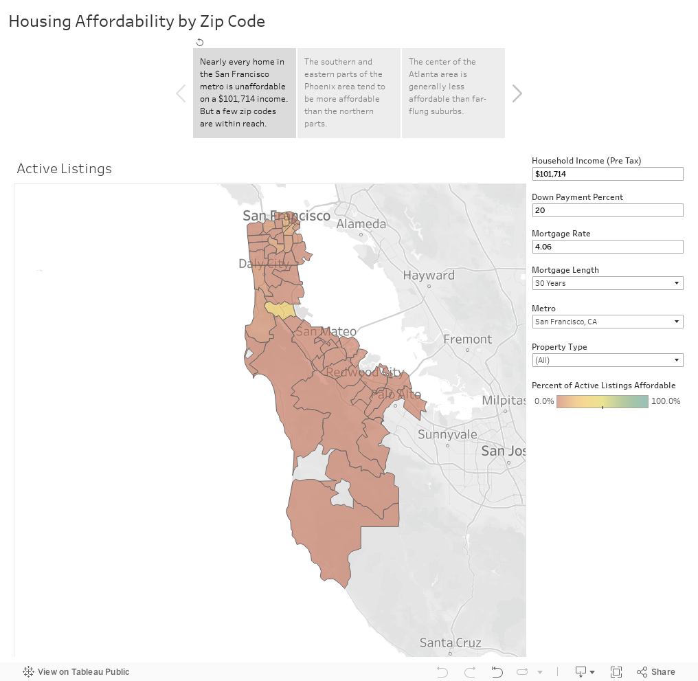
Select San Francisco and you’ll see that in nearly every zip code across the metro, not a single home for sale is affordable on the area’s $101,714 median household income. There’s only one zip code (94066, the San Bruno neighborhood) where more than 30 percent of active listings are affordable on that income. In Phoenix and Atlanta, the breakdown by zip code shows more variety. Click around on the maps above to see which zip codes tend to be more affordable.
To view affordability on any income in any of the top 100 metro areas and to look at affordability for any zip code within them, click here.
Note: The dashboard uses a property tax rate of 1.125%.


