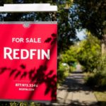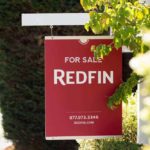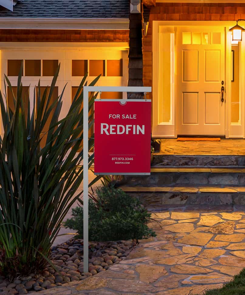
This morning we announced the rollout of a new Redfin yard sign. To celebrate its arrival we sat down with the designers behind the sign to learn what exactly went into its creation. Meet Lindy Kanand and Angela Salvo; these two graphic artists worked closely together to conceptualize and develop the elegant and eye-catching sign.
Q: How did you develop the new design?
Angela: We initially opened the challenge to the entire team to collect as many concepts as possible. We really wanted to push the idea of what a yard sign could be.
Lindy: We started with defining what we wanted our sign to say about us, and we did a ton of research on signage design in general. We looked at what other brokerages were doing and noted what we liked and didn’t like. Once we went through the research and concepting phase, we created close to a hundred different sign designs – everything from monolith structures to unconventional 3D shapes.
Q: A hundred designs is a lot! What kind of factors influenced your final decision?
Angela: We explored materials and spent a good chunk of time prototyping. We looked at different metals, wood grains, composites, PVC brands, diabond as well as different printing processes and die cut options. We knew we needed to stick to materials that could survive all kinds of weather and still be beautiful.
Lindy: When it came time to choose a final direction, we went with a clean design that’s bold and modern, and doesn’t need to shout for attention.
Q: Where did you find your inspiration for the sign?
Lindy: After looking at different types of signage designs from around the world, I took the most inspiration from wayfinding systems. I love the understated beauty of subway and museum signage – unobtrusive with a clear message, and refined.
Q: What makes this new sign unique?
Lindy: Simplicity alone will make the new sign stand out. It’s the most effective design tool to break through the constant visual clutter we are surrounded by every day. We focused on clean lines and functional typography. A lot of thought was put into the special design details – such as the panel of brushed metal sandwiched between the flooded red sign faces, and the half-circle die cut that lets more of that reflective metal peek through.
Angela: By using these different materials and layers, we’ve added depth to the overall piece. We took this as a challenge to create something beautiful and functional, resulting in a sign that we think will distinguish us.
Q: Lastly, what was the impetus for changing the sign?
Angela: Other than our agents themselves, the Redfin yard sign is the most important representation of our brand in the physical world. It was important that the new sign communicate modernity, the quality of our service and our commitment to make real estate better.