Redfin released a big, beautiful new version of its website last night. For the first time in years, there’s a whole new web page on the site — not just a map and a web page for each property on the map — but a set of graphs, pictures, charts, numbers showing all the pricing trends for each of the 9,000 neighborhoods, postal codes and cities Redfin covers. This is the good stuff, drawn straight from the MLS databases real estate agents use to list properties and the tax rolls that counties use to record sales.
It’s a big deal, because consumers have never had access to reliable real estate data down to the neighborhood level. The numbers the newspapers publish every month are for big metro areas like the Bay Area, Boston or Chicago, which mash together neighborhoods that are really worlds apart: Palo Alto and Vacaville, Newton and South Boston, Schaumburg and Highland Park. Saying that all of Boston or Chicago is up or down doesn’t say much.
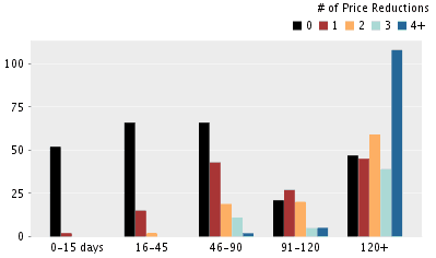 Now you can see what’s really going on with your neighborhood’s prices, right now: dollars per square foot, numbers of homes for sale, days on market, price reductions. We split out condos and houses because they’re priced so differently. The pricing graphs show listings and past sales separately, so you get a view of what sellers expect and what they really got. We give you a list of all the price-reduced homes, all the open houses, all the recent sales. It’s FASCINATING.
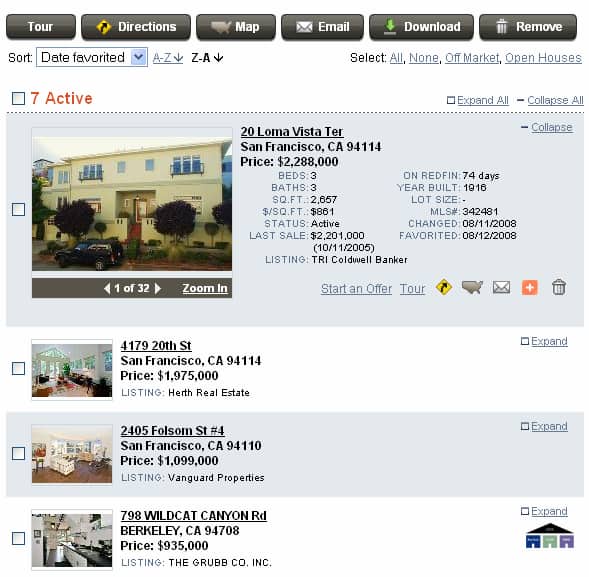
There’s even a graph that is so densely powerful that it’s a little hard to explain: it shows days on markets and price reductions together, so you can figure out whether a listing is about to drop its price. Of course, it’s our favorite. If you can figure it out, it can save you a lot of money.
Favorites on the Map!
The new release has lots more going on too. We finally revamped favorites, so you can map your favorite properties, or delete a bunch of them all at once, or sort them by different criteria like how much they cost or when you first flagged them. Over the past few years, we must have ignored a thousand requests to upgrade favorites, so it’s a relief to finally set things right (or sort of right — we still need to do notes, x-out, the list goes on and ON).
Tours Shopping Cart!
The last big thing we did with this release was to make it easier to schedule a home tour with one of our agents, building a little online shopping cart to add listings to as you browse Redfin.com. It’s a major step toward building a gigantic online application for every step of the home-buying and -selling process, which is how we’ll really make real estate better for consumers and agents and everybody else.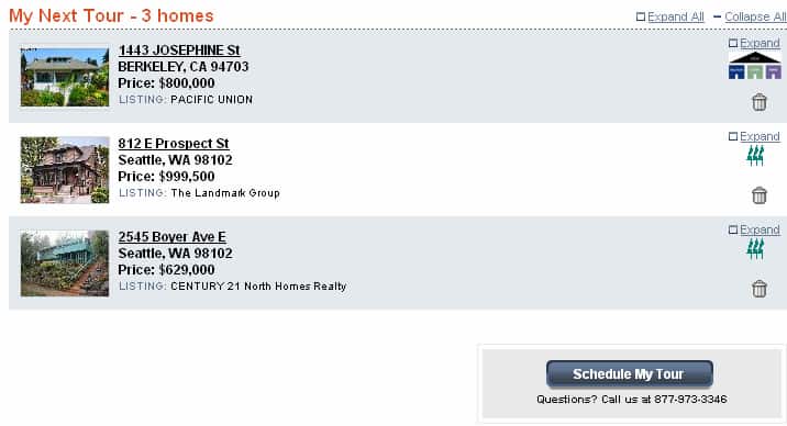
Listings from Zillow! Agent Profiles!
And then there were the little things. The Redfin data team, bloodthirsty for conquest, added thousands more for-sale-by-owner listings, this time from Zillow.com (next up is land and apartment buildings). And we also started publishing agent profiles, showing every one of our agent’s recent deals, so you can check out the raw numbers on what we’ve sold, for how much, in which neighborhoods, with customer ratings. LIVE BY THE SWORD, DIE BY THE SWORD (we promise to give it to you straight)!!!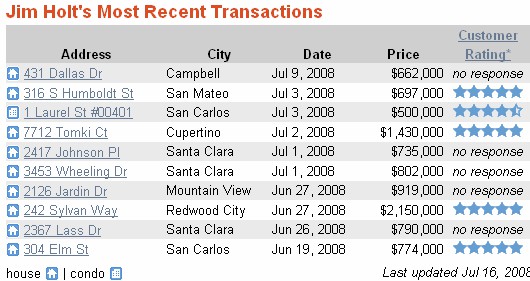
Phew!
So there’s a lot in there and it was a lot of work. Not for me of course, but everyone else! Beyond all the old heroes who designed, tested and shipped this release were a few new faces: stats man Mose Andre in his first gig as a coder, muscle-bound product manager John Kim, Heavy Rubber lead guitarist Ray Sayre, fresh-faced Thomas Young, and man-child Robert Gay. We’re proud of what everyone accomplished, and anxious as always to hear: what do you think?
 United States
 Canada